Figma
,
Webflow
,
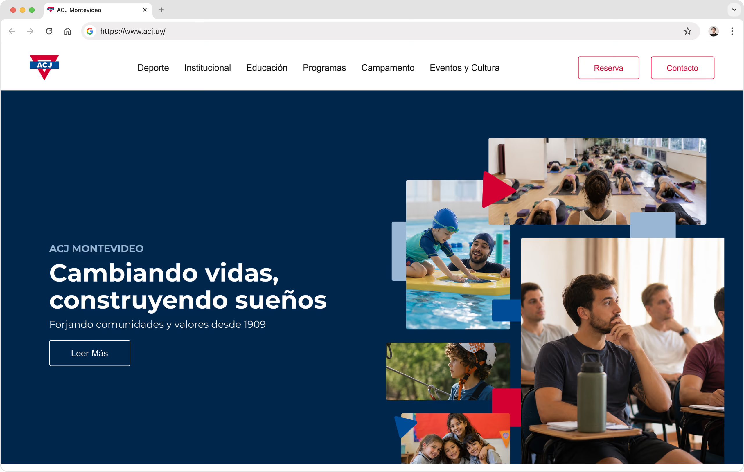
Through research, content strategy, and information architecture, we helped YMCA Uruguay / ACJ Montevideo shape a clearer, mobile-friendly website foundation, designed in Figma and developed in Webflow.
region
Uruguay
TIMELINE
2023
Main Technologies
Figma
,
Webflow
,
CAPABILITIES
Design Studio
Low-code Development


YMCA Uruguay, locally known as ACJ Montevideo, is a traditional and highly recognized institution with a broad presence across sports, education, community programs, camps, cultural activities, and social initiatives.
Over the years, the organization had grown into much more than a sports club. It served different audiences, managed multiple locations, offered a wide range of activities, and communicated with members, families, students, and the broader community through many different channels.
However, its website no longer reflected that scale or importance.
ACJ Montevideo came to us with a website that had become difficult to use, difficult to maintain, and increasingly disconnected from the institution it represented. The site was outdated, not mobile-friendly, and hard to navigate. Information had accumulated over time without a clear structure, which made it difficult for users to understand what the organization offered, where activities were available, and how to access relevant information.
Internally, the marketing team had very limited autonomy. Simple content updates often required contacting developers, which created delays and frustration. Their main communication spaces inside the website were a homepage image slider and downloadable PDF schedules. Those tools were useful to a certain extent, but they were not enough for a large, active institution. Social media was often doing a better job than the website at communicating what was happening.
The challenge was not simply to redesign the website. It was to help ACJ Montevideo understand, organize, and communicate its full digital presence more clearly.
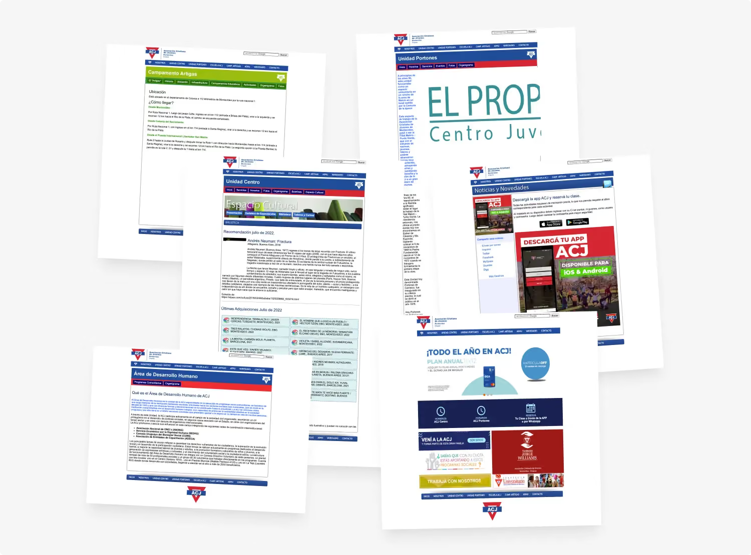
Before designing any screens, we worked closely with ACJ Montevideo’s internal marketing team through weekly discovery meetings. The first step was to understand the existing website in detail. We reviewed the old site page by page, captured its screens, mapped the navigation, and identified content that was outdated, duplicated, hidden, broken, or difficult to access.
This process helped us reveal how much content had accumulated over time, and how hard it had become to understand the full scope of the institution through the website. It also helped us identify a key strategic tension: ACJ Montevideo was widely known for its sports offering, but the organization was much broader than that. The website needed to represent sports without reducing the institution to sports alone.
Once we understood the existing structure, we began exploring different ways to group the content. An early proposal was inspired by the organization’s traditional pillars of mind, body, and spirit. While this direction connected well with the institution’s identity, it risked placing too much emphasis on the motto rather than on how users would naturally look for information.
We then explored other thematic groupings around camps, education, social programs, sports, culture, and the institution itself. Through collaboration with the client, we moved toward a clearer structure that better represented ACJ Montevideo’s real areas of work: Institutional content, sports, education, community programs, camps and outdoor activities, and social and cultural initiatives.
This architecture helped give each area a more defined place within the website, while making the overall experience easier to understand.

The new website needed to support a wide range of users. Some people would visit the site to find sports schedules. Others would be families looking for educational programs, camps, or school information. Some users would be interested in theatre events, workshops, cultural activities, locations, pricing, or ways to contact the organization.
Because of that, we avoided designing around one single user journey. Instead, we focused on creating a flexible structure that could support many different entry points. The goal was to help users understand what ACJ Montevideo offered, where each activity was available, and how to move through the site without feeling lost.
A major priority was also making the experience mobile-friendly, since many practical needs, such as checking schedules or finding location information, often happen from a phone.
One of the most important parts of the project was rethinking how users could explore activities, locations, and schedules. The old experience relied heavily on downloadable PDFs. While those PDFs could still be useful as reference material, they were not ideal as the main way to browse information on a website. They were harder to search, harder to update, less accessible, less useful for SEO, and especially limiting on mobile. We designed a more dynamic model where users could approach the same information from different directions:
This helped solve an important communication problem. If a sport was not available in one location, that did not mean ACJ Montevideo did not offer it. The experience needed to make those relationships clear.
At the same time, we were careful not to make schedules the entire story of the homepage. They were an important practical need, but ACJ Montevideo needed to communicate much more than timetables. The homepage had to balance quick access to useful information with a broader institutional narrative.
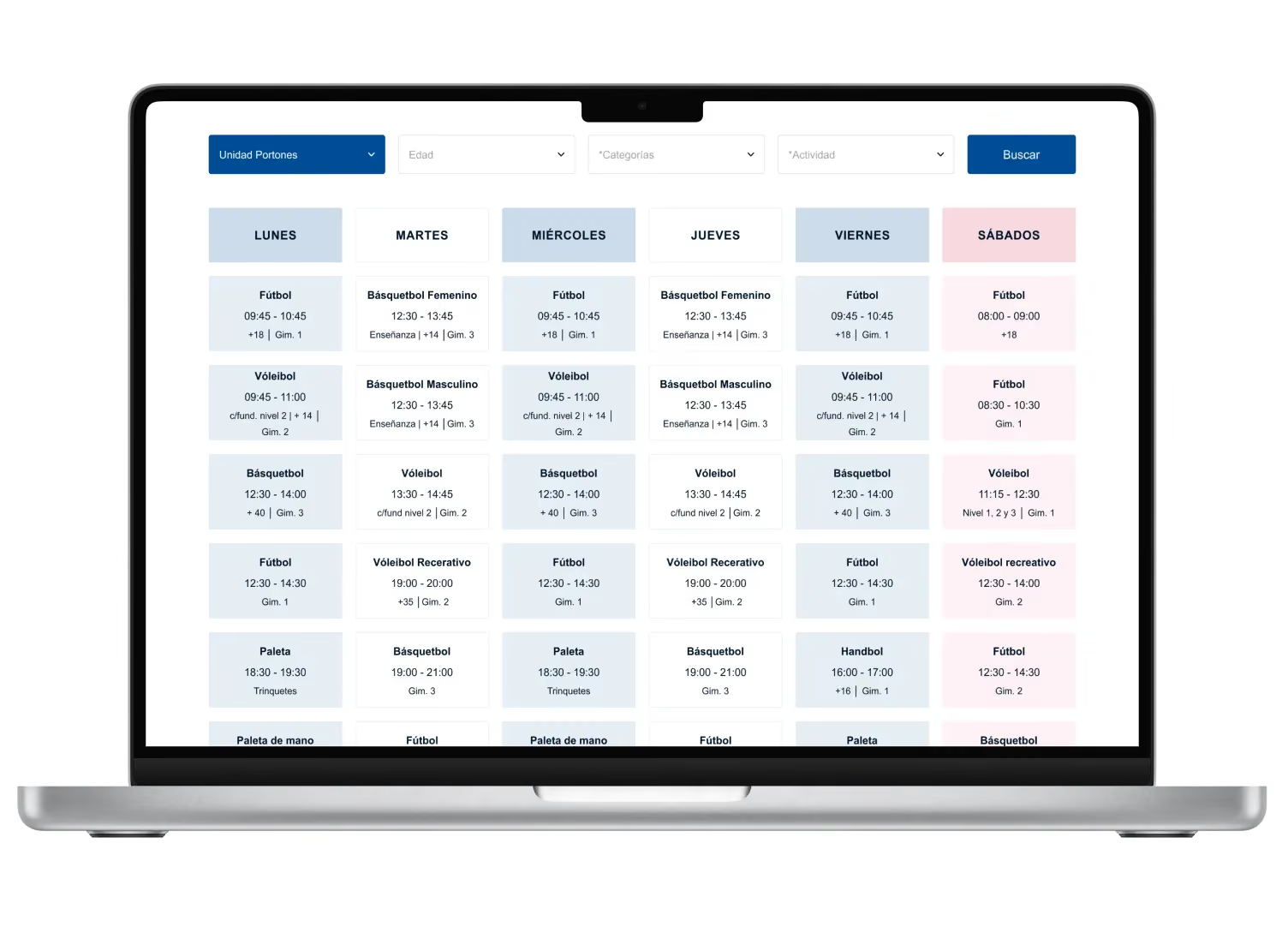
To support the new structure, we created a content model that reflected the different types of information the organization needed to manage. This included content such as programs, announcements, theatre listings, schedules, activities, locations, branches, days, age ranges, levels, activity categories, and other reusable data.
This part of the project was not only technical. It required strategic decisions about how information should be named, grouped, related, and maintained over time. One of the challenges was that the same activity could be named differently across different locations. That created friction when building filters and relationships between activities, branches, and schedules.
The project showed that content structure is not only a website problem. It is also an internal alignment problem. Building a better digital experience required helping the organization move toward clearer naming conventions, more consistent content, and a more maintainable system.
After the research, content strategy, and information architecture work, we translated the new structure into a complete responsive website experience. We designed the website in Figma, creating page structures and layouts that could support the different areas of the institution while keeping the experience consistent and easy to navigate.
Then, we developed the website in Webflow, using CMS collections to give the internal team more autonomy over content management. The goal was not only to deliver a redesigned website, but to create a system that the marketing team could maintain more directly, reducing their dependency on developers for everyday updates.
We also understood that this transition would require support, so training and documentation were considered an important part of helping the team adopt the new platform.

The project gave ACJ Montevideo a much clearer architecture for its digital presence. It helped organize years of accumulated content, define stronger relationships between areas, activities, locations, and schedules, and create a more scalable foundation for future communication. More importantly, it helped frame the website as more than a digital brochure. The website needed to become a central communication platform for a large institution with many audiences, many services, and many internal needs.
For our team, this was an important project in many ways. Five people from GoGrow worked on it with a high level of dedication. It helped us strengthen our research and wireframing process, train junior team members, and give more experienced designers opportunities to lead specific stages and collaborate closely with others.
It also taught us valuable lessons about working with traditional institutions. Unlike startup projects, where decisions are often faster and more centralized, this type of organization requires more alignment, more patience, and a deeper understanding of internal processes.
We also learned that digital transformation depends not only on design and development, but on adoption, decision-making, and organizational continuity. Even when a product is close to completion, internal changes can affect how a solution is launched, maintained, or evolved. That lesson helped us improve our own processes, including how we define project scope, handoff responsibilities, implementation dependencies, and contractual terms.
This project was not only about creating a new website for YMCA Uruguay / ACJ Montevideo.It was about helping a traditional institution make sense of its own digital ecosystem: mapping what existed, understanding what was missing, reorganizing years of scattered content, and creating a clearer foundation for future communication.
For us, the value of the project was in that strategic groundwork. Before Figma and Webflow, there was research, content discovery, internal alignment, and information architecture. That is where the most important transformation happened.

Discover more in our Low-Code Development capabilities page.