Figma
,
Webflow
,
We partnered with InvoiceSherpa to redesign its marketing website in Figma and build it in Webflow, then extended that new visual direction into key areas of the product through UX/UI design.
region
United States
TIMELINE
2023 - Present
Main Technologies
Figma
,
Webflow
,
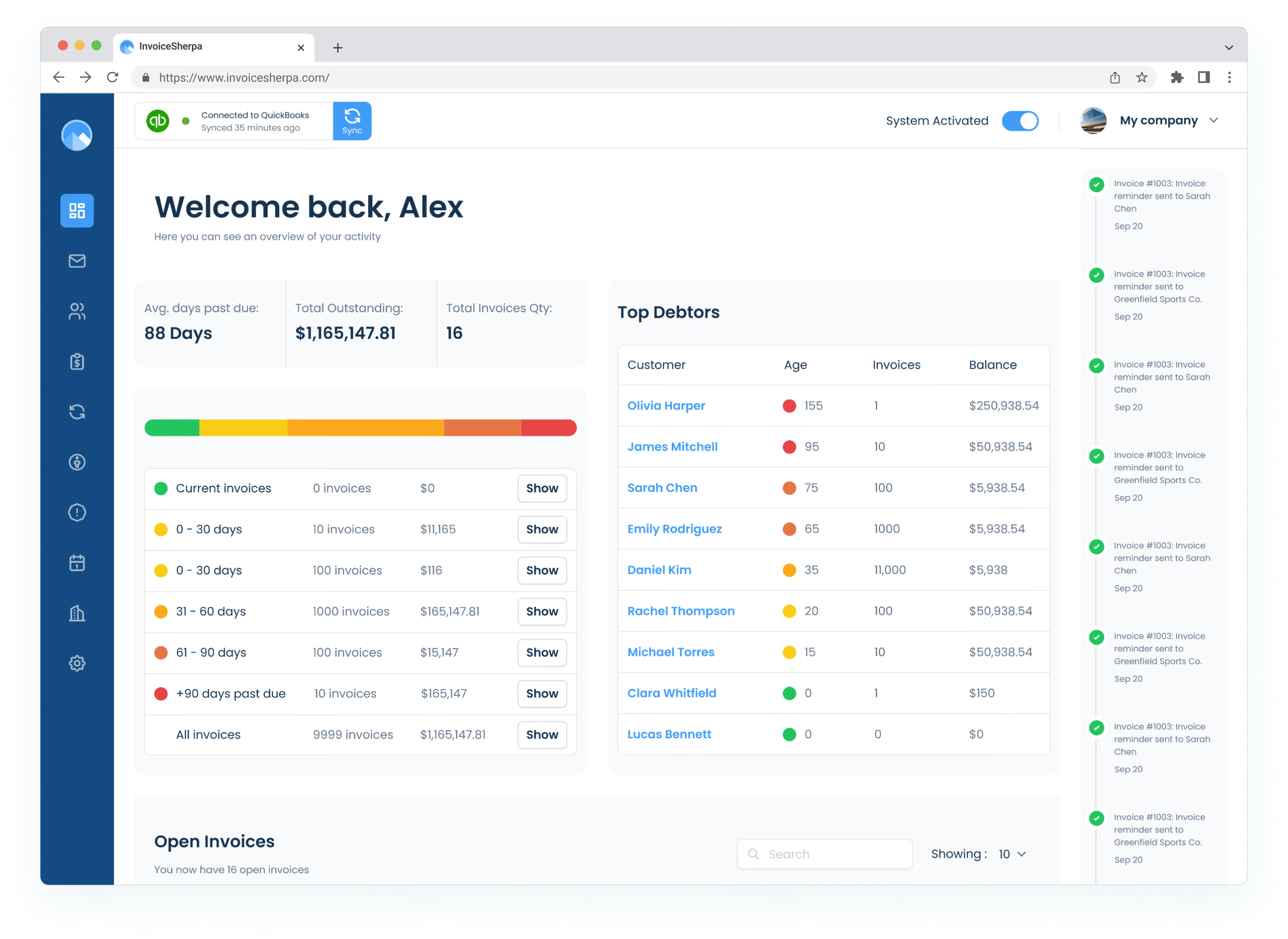
Built to help businesses automate their accounts receivable processes, InvoiceSherpa brings invoicing, payment collection, reminders, and cash flow visibility into a single platform.
Our work began with its marketing website and gradually expanded into the product itself, creating a more connected experience across both sides of the business.
The project began by reviewing InvoiceSherpa’s existing website and identifying opportunities to better explain the product, improve the content hierarchy, and create a more modern visual experience.
Rather than jumping directly into visual design, we broke down the website section by section and explored references from other SaaS and financial products. Different references helped us think through specific challenges, from presenting product features and integrations to highlighting social proof, customer stories, pricing, and conversion points.
This exploration became the foundation for the first wireframes of the Home and Features pages, two of the most important pages for defining the direction of the new website.
InvoiceSherpa already had an established logo and core color palette, so the goal was not to reinvent the brand. Instead, we refined and expanded the existing visual foundation to make the experience feel more current and flexible.
We explored supporting colors and variations that could naturally grow from the existing palette, while adjusting illustration and icon libraries to better match the brand and reinforce key product concepts.
This gave us enough flexibility to create a richer visual experience while keeping the website recognizably InvoiceSherpa.

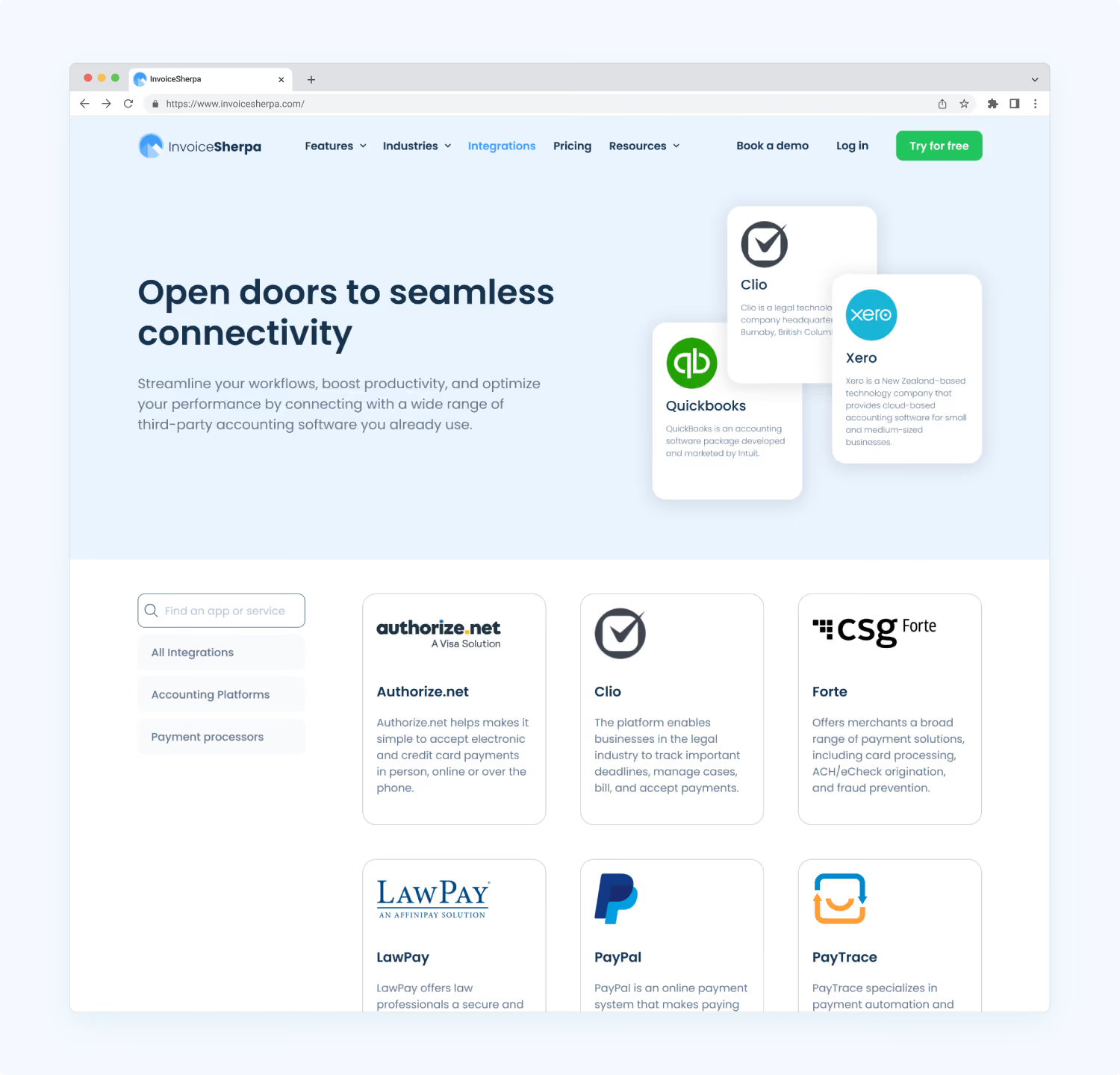
Once the direction was defined, we designed the complete website experience in Figma and developed it in Webflow.
The website included Home, Features, Pricing, Integrations, Case Studies, Blog, FAQs, About, Privacy Policy, and Terms of Service. Webflow CMS was used across testimonials, integrations, case studies, blog content, FAQs, and legal pages, giving the InvoiceSherpa team a flexible structure for managing and expanding the website over time.
Throughout the process, the website was designed responsively and translated into a reusable Webflow foundation rather than a collection of isolated pages.
The website established a new visual foundation for InvoiceSherpa, but the work did not stop there. As the collaboration continued, we began translating the same core principles into the existing product experience. Typography, color, and iconography provided the initial connection, while the application itself required a much deeper and more comprehensive UI foundation.
The goal became twofold: modernize an established product and create greater visual continuity between the marketing website and the software customers used every day.
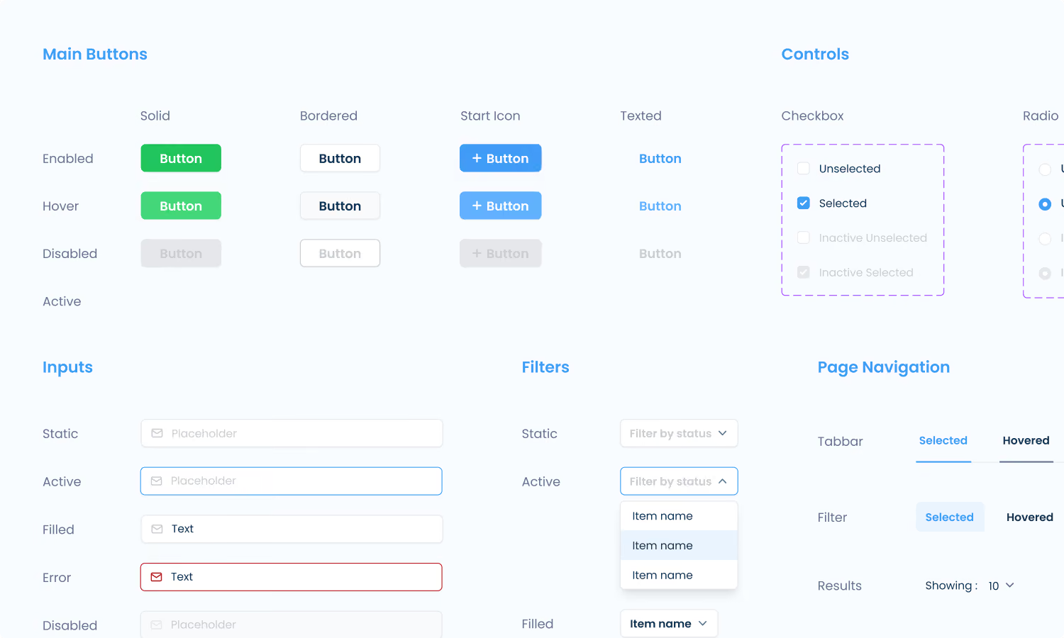
The website’s lightweight visual foundation was only the starting point. For the application, we created a much more comprehensive design system from the ground up, while maintaining the core visual principles introduced through the marketing site.
The system defined typography, an expanded color palette, iconography, buttons, inputs, search and filtering patterns, navigation, tables, notifications, and other recurring interface elements.
This provided a shared foundation for redesigning existing screens and exploring new functionality without solving every interface decision from scratch.
InvoiceSherpa was already an established and functioning product. Our role was not to redesign the entire platform at once, but to improve it progressively.
Using the new product design system as a foundation, we worked across existing screens, evolving workflows, and new features that required additional UX and UI guidance.
The work combined redesign and product growth: modernizing established experiences, reorganizing functionality where needed, and helping define new features as the platform continued to evolve.
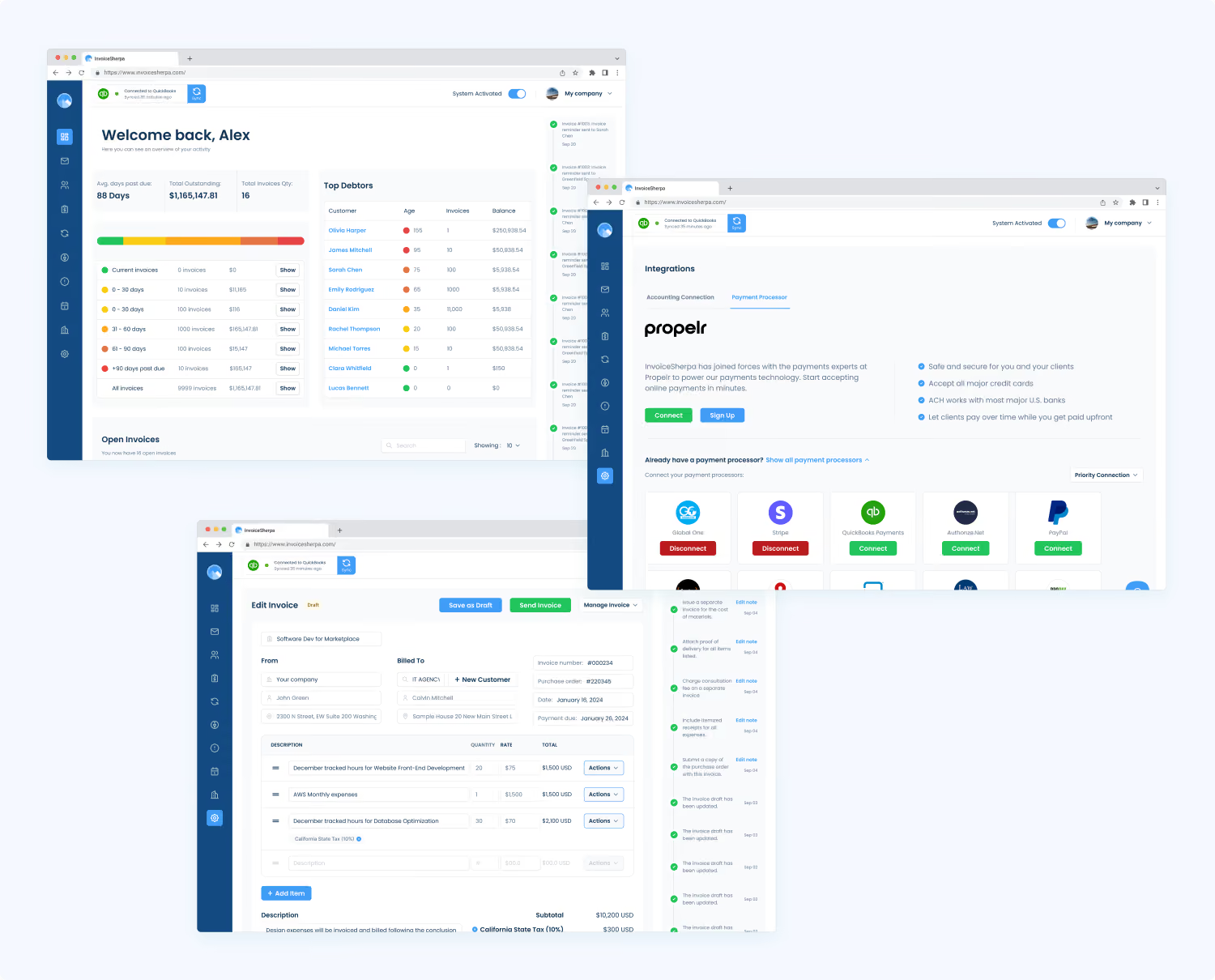
Product designs were created and reviewed in Figma before being handed over for implementation. Once a direction was approved, InvoiceSherpa’s development team reviewed the proposed experience and raised technical considerations when a solution would be difficult to implement or inconsistent with the existing product architecture.
Communication through Slack and Figma allowed the teams to refine solutions before development and keep design decisions grounded in the technical reality of the product.
What began as a website redesign grew into an ongoing design partnership across InvoiceSherpa’s digital experience.
The new website created a clearer way to communicate the product and a refreshed visual direction for the brand. The product work then expanded that foundation into a more complete system, supporting both the modernization of existing experiences and the design of new functionality as the platform continued to evolve.
Today, we continue to collaborate with InvoiceSherpa on demand, helping the team solve new design challenges as they emerge.

Discover more in our Low-Code Development capabilities page.