Figma
,
Webflow
,
From brand identity to design and Webflow development, we helped Oneplify launch into the HR tools market.
region
Uruguay
TIMELINE
2025 - 2026
Main Technologies
Figma
,
Webflow
,
CAPABILITIES
Design Studio
Low-code Development


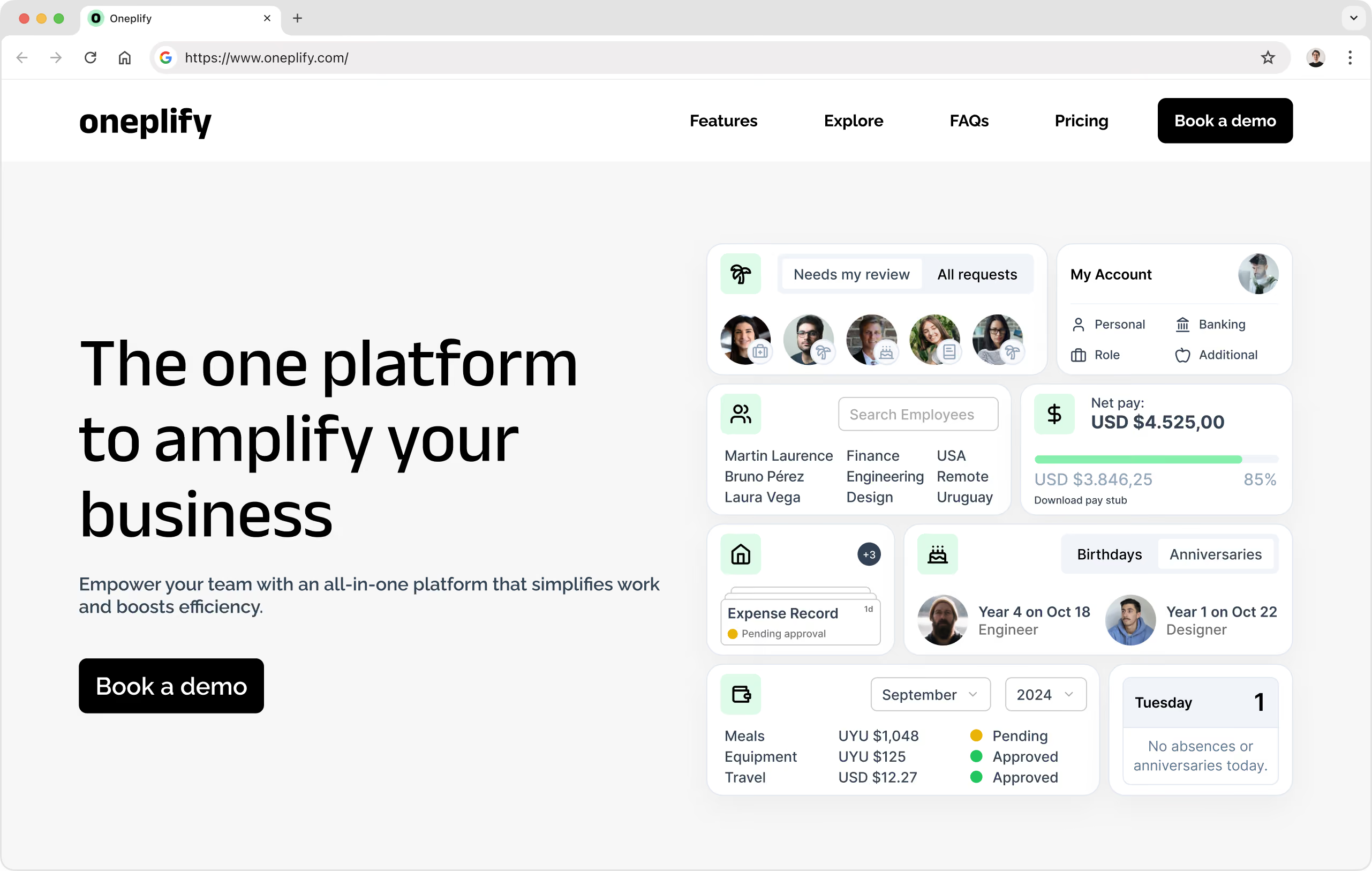
Oneplify is a comprehensive People Operations platform designed to help companies manage time off, expenses, employee records, and internal workflows from one centralized system. Built for growing teams, the platform focuses on simplifying operational complexity through a clean, intuitive experience that both employees and HR teams can easily navigate.
Originally, we designed the app for the GoGrow team, based on shadcn/ui components, accelerating the design and development process. Great experience, but a sales risk at the moment it crossed the line to become an internal tool to help more companies.
The Oneplify team asked us to shape the brand identity from the ground up and deliver the complete marketing website experience. Creating consistency between brand, product, and marketing experiences became a core part of the project from day one.
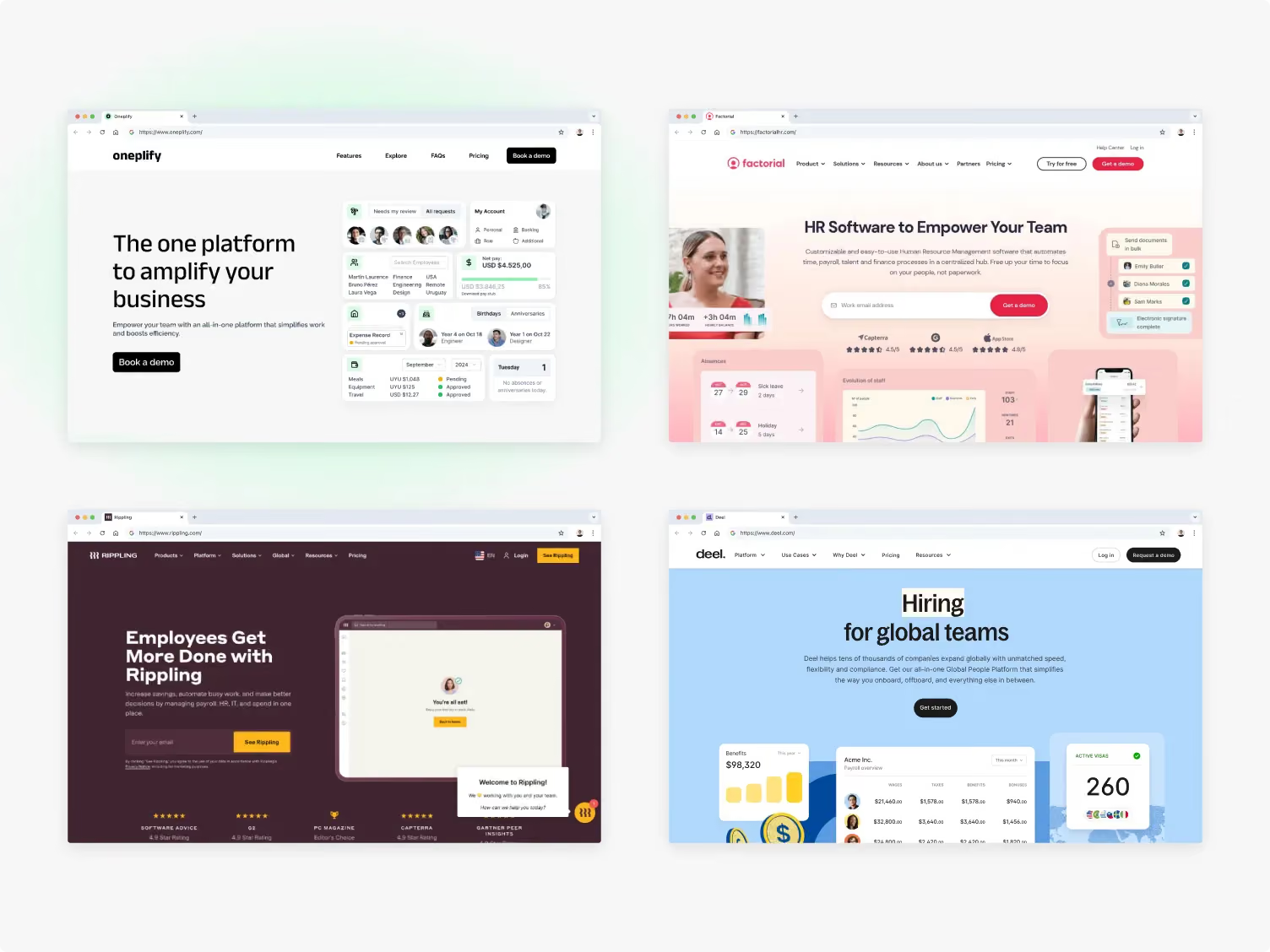
Before defining the visual direction, we conducted a research phase focused on understanding how HR and People Operations platforms position themselves visually within the market. Many products in the category relied heavily on dark enterprise aesthetics, highly saturated interfaces, or overly technical visual systems that increased the perceived complexity of the product.
Our goal was to position Oneplify differently: intuitive without compromising trust, structured without feeling rigid, and operationally robust without appearing overwhelming. This became the foundation guiding both the brand identity and the website experience.
We started by developing Oneplify’s visual identity and design direction, creating a system that balanced professionalism with approachability. To support this, we developed a soft green-centered palette supported by neutral tones and subtle gradients, creating a calmer and more human visual language. In color psychology, green is commonly associated with growth, balance, and well-being, concepts strongly aligned with People Operations and employee experience.
Typography and layout systems were designed to reinforce clarity and warmth at the same time. We used clean geometric forms, generous spacing, and simplified assets inspired by the platform’s real functionality to make the product feel intuitive from the first interaction.
From there, we expanded the visual direction into a cohesive design system with reusable patterns, consistent rules, and a flexible structure capable of supporting future growth across different touchpoints.
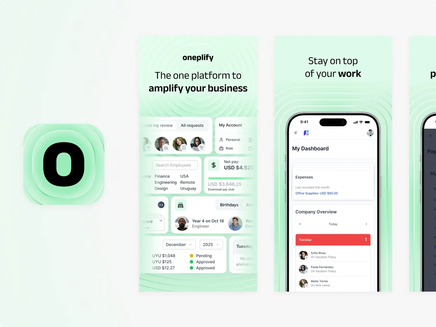
This foundation allowed Oneplify to maintain a consistent and scalable identity while keeping the overall experience clean and easy to navigate as the platform evolved.
The challenge was not only to design a polished SaaS website, but to create a digital experience capable of supporting Oneplify’s long-term growth.
The website needed to communicate clarity, trust, and operational simplicity while presenting a growing feature set in a way that felt approachable for HR leaders and decision makers. At the same time, the system had to remain flexible enough to evolve as the product matured.
Once the visual direction was established, we translated the brand into a complete website experience focused on clarity, structure, and usability. Special attention was given to content hierarchy, spacing, modular layouts, and navigation patterns to help simplify complex People Operations workflows and make the platform easier to understand at a glance.
We also designed the website with scalability in mind, creating reusable page structures and flexible UI patterns that could support future expansion without compromising consistency.
The result is a refined SaaS experience that balances product communication, conversion, and long-term maintainability.

Once the design phase was complete, the entire website was developed in Webflow with a scalable structure optimized for maintainability and future growth. We also implemented a multilingual architecture with English, Spanish, and Portuguese versions to support international audiences from launch.
A major focus during development was ensuring consistency across all localized experiences. Beyond simple translation, the website was designed with flexible structures capable of supporting different content lengths and linguistic variations without compromising clarity or layout integrity. Product visuals were also adapted per language to create a more cohesive experience across regions, enabling the Oneplify team to manage updates efficiently as the platform evolves.
We also developed a set of custom product visuals and simplified interface mockups designed specifically for the marketing experience. Instead of relying exclusively on raw product screenshots, we created curated assets that communicated workflows and features in a clearer, more approachable way while staying consistent with the real product UI.
At the same time, key sections of the website were enhanced with interactive-style product previews, helping people better understand the platform before adoption.
To accelerate delivery without compromising quality, we used a low-code workflow combining Figma and Webflow. The site was structured using reusable components, a CMS-driven architecture, and a modular design system built to translate directly from design into development. This approach allowed us to maintain consistency across pages, simplify content management, and ensure the website could scale efficiently as new sections and features were added over time.
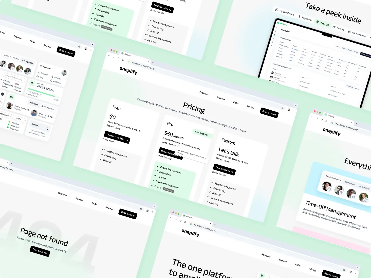
Oneplify evolved into a cohesive digital ecosystem that connects brand, product, and marketing into a unified experience.
By combining scalable design systems, multilingual Webflow development, and product-focused UX thinking, we created a flexible foundation that allows the platform to grow while maintaining clarity, consistency, and ease of management across every touchpoint.

Discover more in our Low-Code Development capabilities page.