Figma
,
Webflow
,
A redesigned Webflow website gave SponsorPitch a new visual direction that later extended into key areas of the product, making the platform feel more modern, consistent, and ready to scale.
region
United States
TIMELINE
2023 - 2025
Main Technologies
Figma
,
Webflow
,
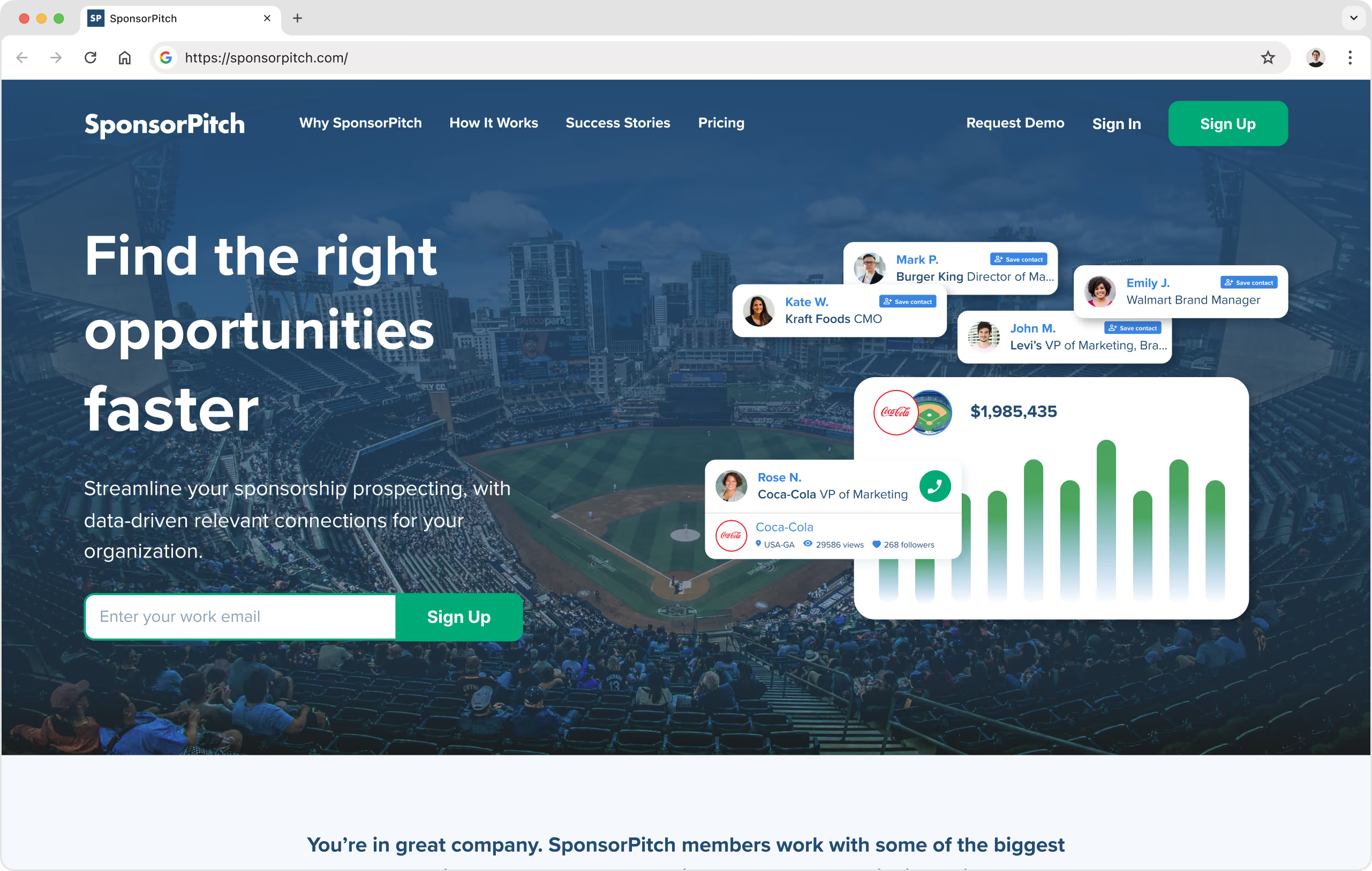
SponsorPitch is a marketplace for sellers and brands. The platform helps sponsorship sellers post their pitch and be discovered by brand marketers looking to reach specific audiences. At the same time, brands can set preferences, receive notifications when relevant pitches are added, and filter through opportunities that align with their values, audience, and marketing goals.
By combining sponsorship data, pitch listings, brand profiles, recent deals, and contact information, SponsorPitch helps both sides of the marketplace find better partnership opportunities faster.
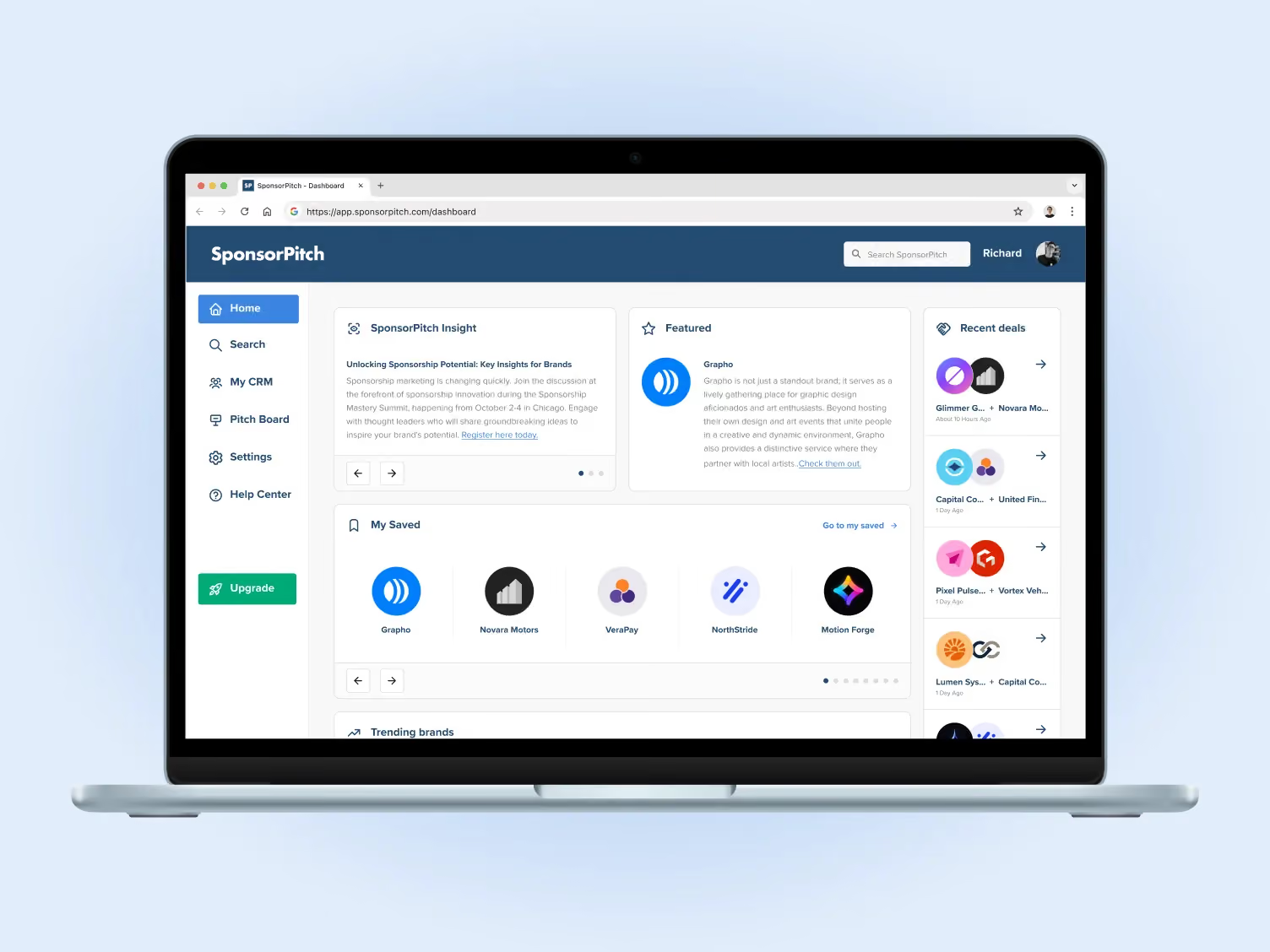
SponsorPitch first came to GoGrow looking for support with the design and Webflow development of its marketing website. The goal was to modernize the brand’s digital presence and explain the product more clearly through a simple, focused landing page.
Over time, the collaboration expanded. As GoGrow’s development team began supporting the evolution of the product, our design team also started helping with key product screens, new features, visual QA, and a more consistent UI direction across the platform.
The challenge was not to redesign everything from scratch at once. SponsorPitch was already a real product with active users, multiple features, and evolving business needs. Instead, the work required a practical design approach: improving the experience sprint by sprint, while creating enough structure to help the product scale more confidently.
The first part of the collaboration focused on SponsorPitch’s marketing website. We designed a clear landing page that could explain the value of the platform, present key benefits, and give potential users a better understanding of how SponsorPitch helps brands and sellers connect.
The process started with wireframes to define the page structure, content hierarchy, and main sections. From there, we moved into high-fidelity designs, exploring a more modern visual direction that could make the brand feel sharper, clearer, and more aligned with the sponsorship, marketing, and sales space.
Once the design was approved, the site was developed in Webflow.

Beyond launching the website, one of the main goals was to leave SponsorPitch with a structure that could continue growing after our initial work. We set up global styles and a clear Webflow structure so the client’s marketing team could keep scaling the site based on the foundation we created.
This made the website more than a one-time landing page. It became a flexible starting point that SponsorPitch could continue building on, while keeping the visual direction consistent.
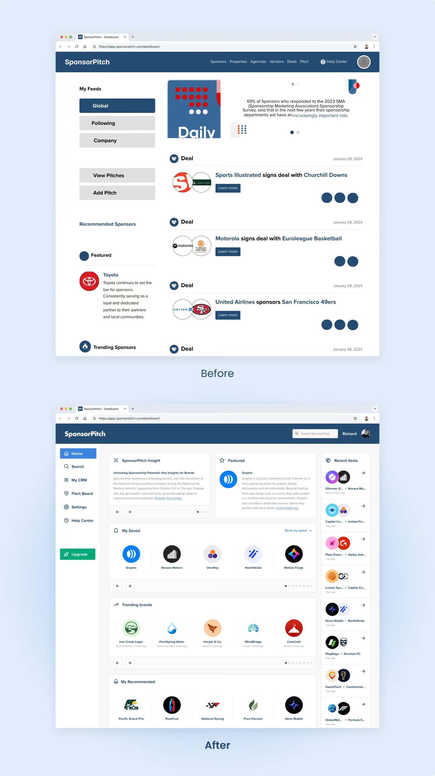
After the website, the next step was helping bring that updated visual language into the product. The platform already had valuable functionality and a strong data foundation, but the interface needed a more modern and consistent experience to support the next stage of growth.
Our team worked on selected product areas where design could have a clear impact: key pages, new features, dashboard experiences, pitch flows, detail pages, navigation patterns, and visual QA of developed screens.
This allowed SponsorPitch to modernize the product progressively, without needing to pause everything for a full redesign.
The product work followed a lean and collaborative process. We used Jira as the main board and met with the SponsorPitch team every two weeks for design reviews and planning. On GoGrow’s side, the team included two designers with Webflow experience, a developer, and project management support. On the client side, we worked closely with the founder and CEO, along with a product advisor.
Unlike the website, where wireframes were useful to define the page structure, product design often moved faster. Many screens were designed directly in high fidelity, or through wireframes that were already very close to a first high-fidelity version.
This approach helped us move efficiently within sprint cycles, while still giving developers and stakeholders a clear visual reference for what needed to be built.
To support the product work, we created a practical design library in Figma. This included text styles, colors, buttons, icons, inputs, checkboxes, badges, and other reusable UI elements. It was not about creating a large, formal design system for documentation’s sake. It was about giving the team a shared foundation to design and build more consistently.
This helped us approach the interface in a more atomic way. Instead of solving every screen as a separate case, we could rely on defined components and patterns that made future work easier to scale.
One important part of the product design work was rethinking how the interface adapted across screen sizes. We reoriented the design approach around a 1440px structure, creating a more practical foundation for desktop product screens. This helped improve content hierarchy, spacing, readability, and the relationship between side navigation, cards, tables, filters, and content areas.
We also created mobile designs, mainly as a guide for how the product should adapt at smaller resolutions.
Our design work did not stop once the Figma screens were approved. We also supported the team with visual QA, reviewing developed screens and comparing them against the approved designs. This included details such as spacing, alignment, typography, responsive behavior, component consistency, button styles, filters, modals, and overall hierarchy.
At the same time, we approached QA with a realistic product mindset. In an active product with sprint limits, budget considerations, and development constraints, not every small visual detail needs the same level of attention. The important part was understanding which adjustments had a real impact on usability, consistency, and user perception.
This balance helped keep the product moving while still protecting the quality of the experience.
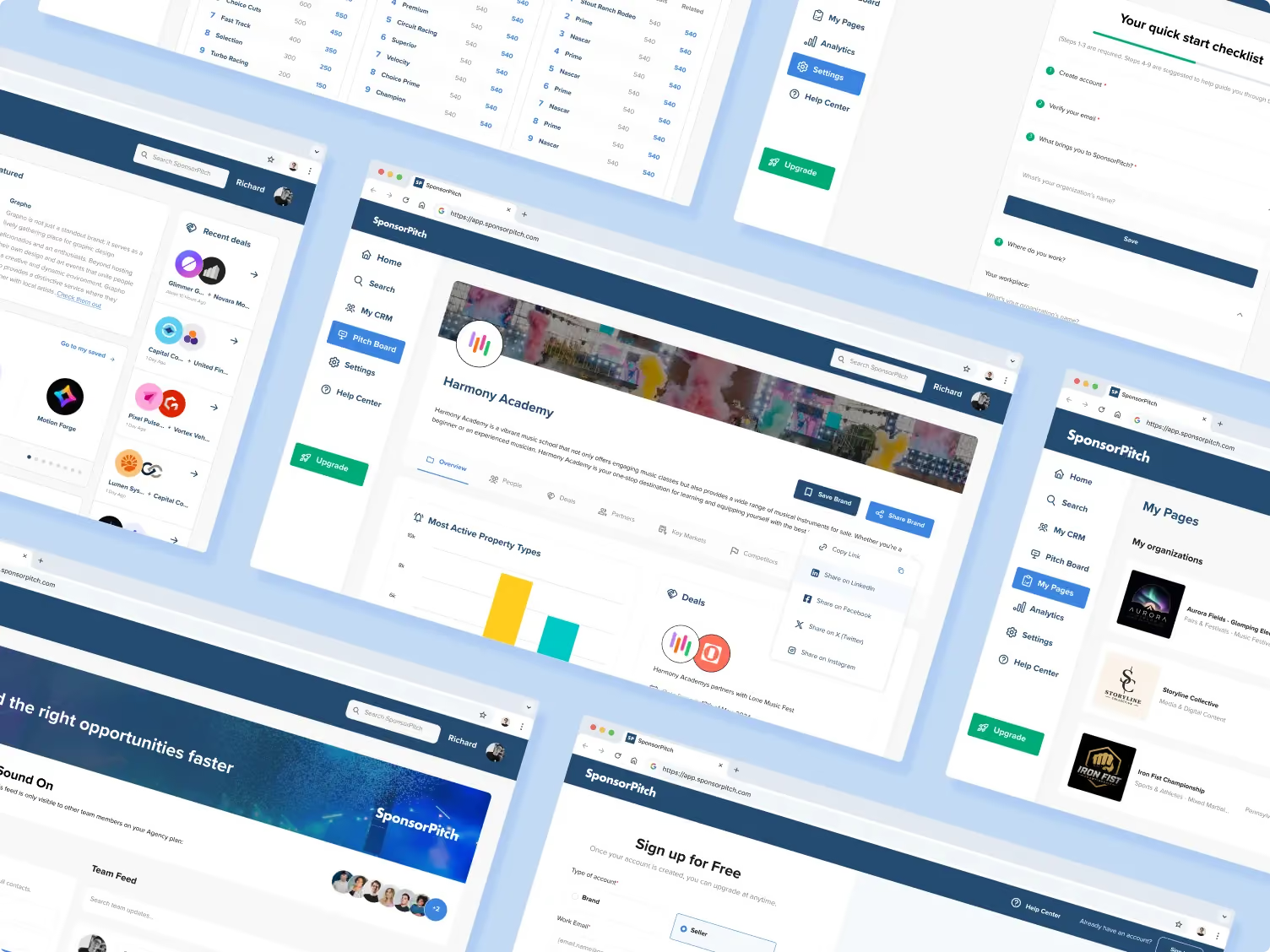
Alongside the website and product work, GoGrow also supported SponsorPitch with selected marketing assets, including social media pieces, company deck materials, and SendGrid email designs. These were not the main focus of the collaboration, but they helped keep the brand experience more consistent across different touchpoints.
SponsorPitch did not need a design process that ignored the realities of an active product. It needed a flexible design partner that could help modernize the experience while working within existing priorities, budgets, and development cycles.
Through Webflow development, Figma design, product UI support, a practical design library, and visual QA, GoGrow helped SponsorPitch connect its marketing website and product experience under a clearer and more consistent visual direction.
"They communicated well, and the transition went smoothly for us."

Discover more in our Low-Code Development capabilities page.