Figma
,
The project combined UX strategy, user flows, and Figma prototyping to transform Triple M’s accounting process into a clearer, more intuitive experience for its clients.
region
Canada
TIMELINE
2023 - 2024
Main Technologies
Figma
,

Triple M Accounting is a Canada-based accounting firm from the Greater Toronto Area, operating since 1999. The firm provides financial, tax, and administrative services to both individuals and businesses. This includes corporate tax, CRA audit support, financial statements, payroll services, SR&ED (Scientific Research and Experimental Development), and support for international investors.
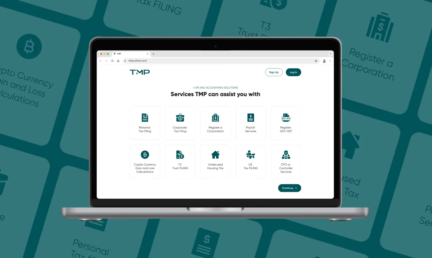
Triple M’s team is committed to delivering outstanding services, and prioritizes client education as a core part of their approach. They needed to modernize a traditionally manual client intake process without losing the personal and trustworthy experience their clients expected.
The platform needed to support multiple accounting services, different customer profiles, conditional questionnaire paths, personalized quotes, payments, and document collection. At the same time, it had to remain approachable for people with little or no accounting knowledge.
The design challenge was therefore not simply to digitize an existing process. It was to make a complex service easier to understand, complete, and manage.
We started by working closely with Triple M to understand how they assessed new clients and what information they needed for each service. From there, we mapped the different steps a client could follow and turned the company’s internal process into clear user flows. This helped us define what users needed to see, answer, and understand at each stage.
By organizing the experience before designing the interface, we created a clearer structure for the product and gave the client, design team, and developers a shared reference for the next stages of the project.

We designed an end-to-end journey that guided users from selecting a service and completing a tailored questionnaire to receiving a quote, creating an account, making a payment, and submitting the required documents.
Each stage was designed to prepare users for the next. Questions were divided into manageable steps, progress was made visible, and contextual information was introduced when users needed it. After purchasing a service, users entered a dashboard where they could review active procedures, understand their current status, and follow a structured checklist of required documents.
Bringing these interactions into one connected journey helped turn a fragmented administrative process into a more transparent and manageable experience.
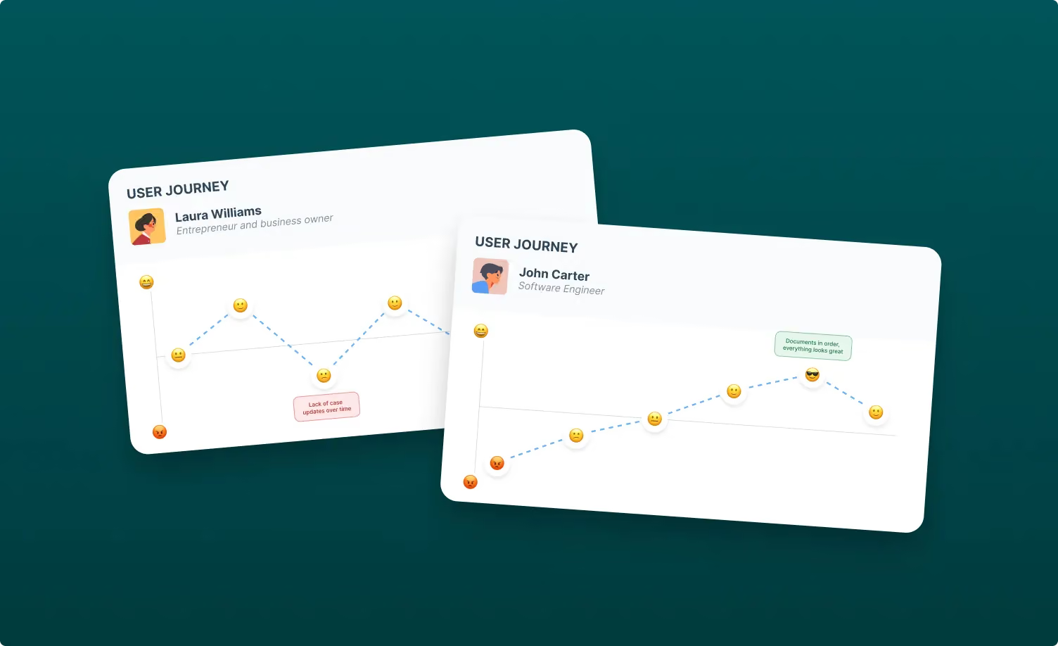
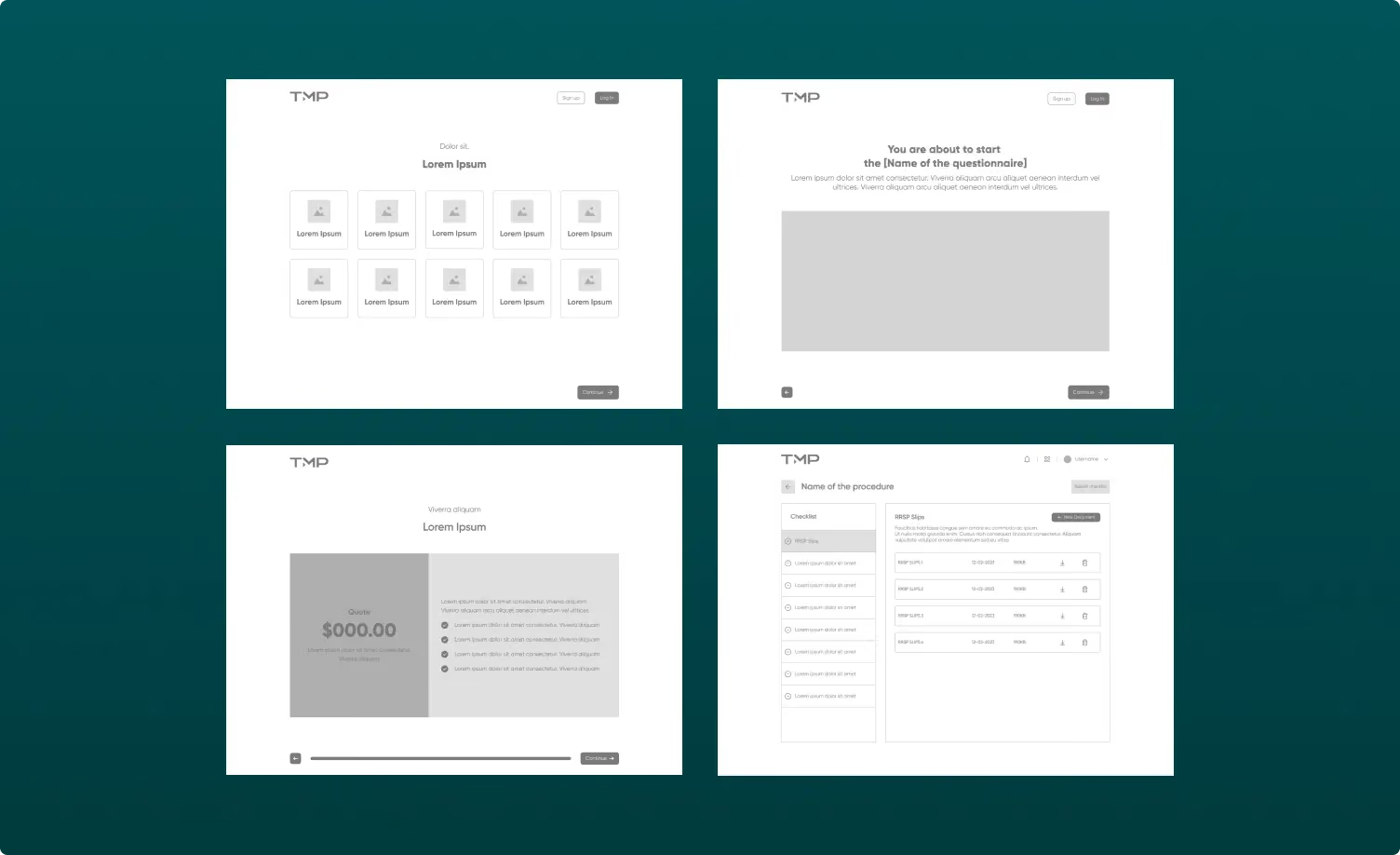
Once the main user flows were defined, we moved into wireframing to explore the structure of each screen, organize the content, and validate the experience before focusing on visual details. After reviewing and refining the wireframes with Triple M, we developed the high-fidelity interface in Figma, applying the brand’s visual language and defining the components, interactions, and states needed across the product.
Each experience was designed for both desktop and mobile, adapting layouts and interactions to ensure the platform remained clear and easy to use across different screen sizes.
We then connected the key screens into an interactive Figma prototype, allowing the client to navigate the experience before development began. The final designs and prototype also became the main reference for the development team during implementation.
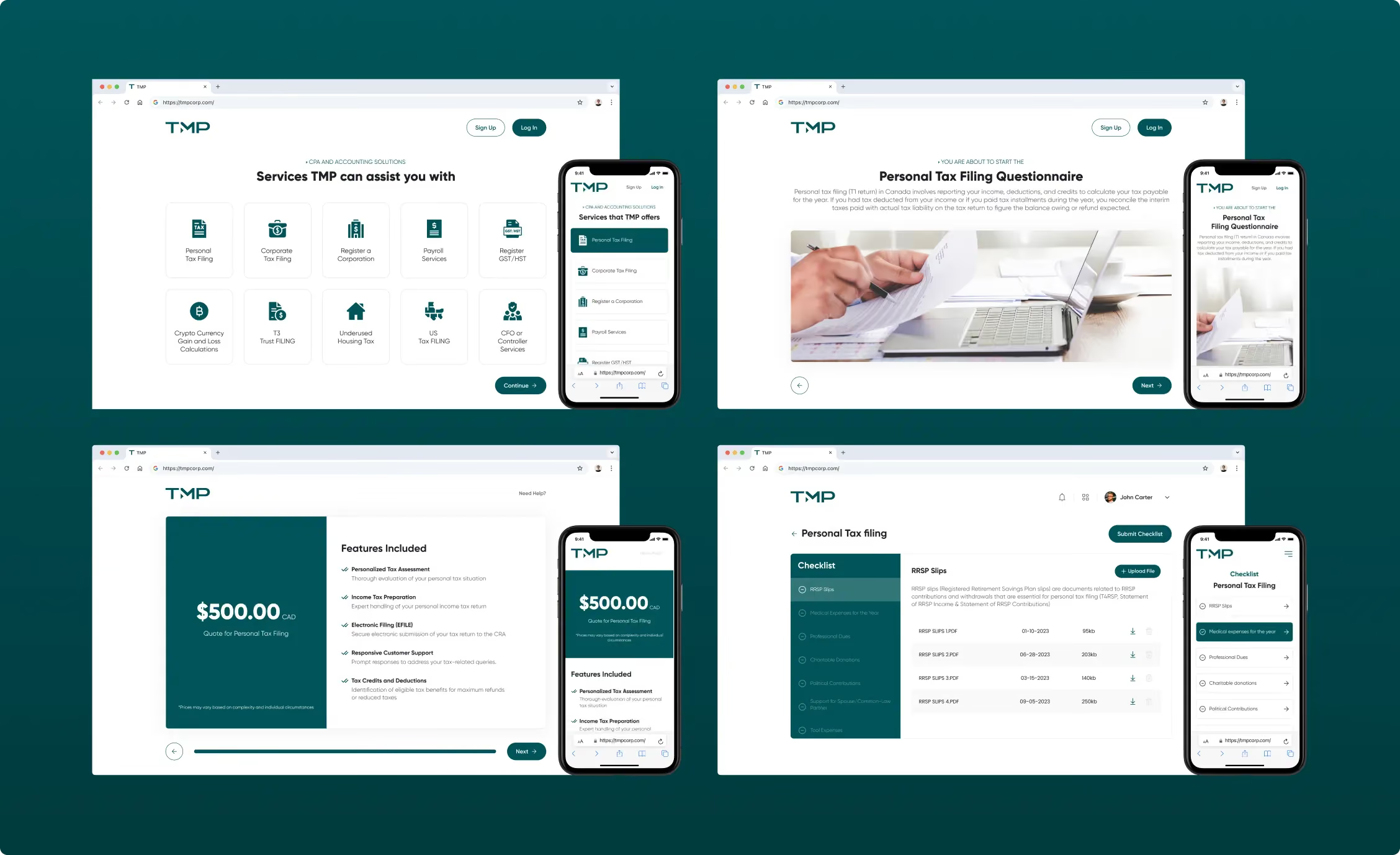
The product needed to accommodate different services, customer circumstances, and outcomes without creating an inconsistent experience. Depending on a user’s answers, the questionnaire could introduce different questions, request additional information, and generate a different quote or document checklist.
To support this complexity, we created reusable interface patterns rather than treating every screen as a separate solution. Consistent layouts, navigation controls, form behaviors, alerts, progress indicators, and content structures allowed the experience to adapt while remaining familiar.
This systems-based approach also created a stronger foundation for introducing new services and workflows in the future.
The design phase gave Triple M a validated product direction before development began.
By translating internal accounting processes into clear flows and reusable interface patterns, we helped create an experience that guides clients from their first question through the initial stages of service delivery.
The result was not simply a digital questionnaire, but a cohesive client journey designed to improve clarity, reduce friction, and build trust from the first interaction.
For us, the project reinforced a principle that shapes our product design work: understanding the business in depth is what makes it possible to create a simpler experience for the user.
Want to learn more about how GoGrow brought this product to life beyond the design phase? Read Digital Experiences that Simplify Financial Services to explore how our development team built the custom platform behind Triple M’s digital client experience.